
Tuesday
0 Best Ways To Sell Your Designs Effectively
We all know that being a freelance designer isn't always easy. Ans selling your designs are hard because your clients won't always like everything you do. Here are some great tips if you are trying to get more design clients and keep the ones you already have effectively. Enjoy
1.Know and understand the nature of your client.

Image: Eduard Titov
Whenever you make presentations, you have to know your clients first and try to determine their taste. Maybe at the beginning, it would be the secretary or a coordinator that will speak to you; you can ask him/her about this without being obvious that you are actually asking about it. Try to know and understand the person who will make the final decision for the design.
2.Consider some of your client’s design directions.

Image: Eduard Titov
You may ask the person who first spoke to you certain designs that they like or they would like to match. Ask the color schemes they want and the type of impact they would like to give to the audience. They may also give you some suggestions. Consider these suggestions but put a designer’s touch into it.
3.Come up with a good idea and concept.

Image: Rego – d4u.hu
Of course, you wouldn’t want to waste your time designing something that will just be rejected. You will surely give your best. Make sure that the concept of your design suits the preferences of your client.
4.Make a visually appealing design.

Image: Eduard Titov
Good designs give a huge impact with one glance at it. The reason why graphic designers are hired is to create designs that are visually appealing and pleasing. So, do not make your designs so complicated that it confuses the eyes and the message it tries to give.
5.Show your best works only.

Image: Eduard Titov
Some clients would like to choose from the different works you have done. It is actually wise to make at least two or three designs so that your client will be pleased that you are giving them options and you are willing to adjust according to what they want. But in presenting, make sure to show only your best designs. Do not include those which you aren’t confident of.
6.Have a good justification for your designs.

Image: richardscalza
After making your designs, show it to your client and have a good rationalization as to why you made it that way. It is impressive if you are able to explain your work well to your clients. There must be a good reason for everything you have placed there.
7.Learn to defend your designs.

Image: photostock
Sometimes, your client might not be really pleased with the output and would give a suggestion that you think will only worsen the design. They might give a feedback that you will not like. All you have to do is defend your work by explaining to them in a good manner. But DO NOT BE TOO DEFENSIVE. You will risk your name as a designer if you sound and appear like you are insisting that what you have done is right. Remember, even if your client is a design illiterate, he still needs your respect.
8.Be patient with your clients.

Image: lady_lestrange
Some clients are appalling and irritating. Some may even want you to do lots of changes and still others really want you to redo your design. They might say a lot of things and give so many feedbacks that you feel like you want to walk away already. But don’t do that. You have to be patient. Some clients actually do that in purpose to determine your attitude as a designer.
9.Ask for specific feedbacks.

Image: natalijashirokova
In the presentation of your designs, ask your client to give you specific feedbacks so that you will know the exact thing to do and the exact thing to say. This will help you improve your work.
10.Do not charge too much.

Image: graur razvan ionut
Since we are doing business here, it would involve your fee or your charge to the work your client is asking you to do. However, make sure that the price is right. Do not overcharge. Some designers even explain to their clients why they are asking for such a fee. Make sure that you talk and agree on a certain charge before you proceed with your work. Also, you have to explain additional charges before the start of the project so that you wouldn’t have problems when paying time comes.
11.Finish designs on time or ahead of time.

Image: dream designs
Designers have to be time conscious especially that your clients will be using your designs for a specific purpose and a specific time. It is always wise to finish it ahead of time so that necessary corrections can still be done. Clients like designers who are punctual when it comes to the delivery of the output.
12.Suggest a good production plan.

Image: Ambro
After everything is done and the design is approved, you can help your client by suggesting better ways to produce and execute the designs you have made for them. Your client will be impressed that you are concerned with everything pertaining to the design which will benefit both you and your client.
Marketing skills and a good salesman tongue will help you sell your designs without having a hassle. It is actually a self-learned process which will develop more as you interact with your clients. Just bear in mind that your main goal is to give the best design to your client and for you to get the right monetary compensation afterwards. So, always give your best!
Don’t forget to subscribe to our RSS-feed and follow us on Twitter and Facebook for recent updates.

| About The Author | ||||
|

If you enjoyed this post, please retweet or stumble to say thanks!
Monday
0 22 Unpublished Star Wars Pictures You Must See.
I am a huge fan of Star Wars and George Lucas. Here I collected 22 unpublished pictures from backstage when it was filmed back in 1977. They took me back in time to remember how magical making a move and special effects was. Today it's all about computers, green screens and CGI.Leaving behind the wonder of how it was made - Enjoy!


| About The Author | ||||
|
If you enjoyed this post, please retweet or stumble to say thanks!
Thursday
20 Mistakes Customers Make When Requesting A Logo
In this article you gonna see some common mistakes companies and small business owners make when having their logo design and brand identity created. They range from what you would think are obvious to some things you may have not thought about. Enjoy
![]()
1: Forgetting What A Logo Is
One of the first mistakes a company will make is forget what a logo is. If you are in the process of picking your first logo, it is possible you don’t really know what a logo is. This isn’t because you are ‘stupid’, nor should you feel that way for not knowing – in fact a lot of designers don’t know, or forget this. Truth is, most people don’t know what a logo is.
A Logo Is:
- A logo is a design.
- A logo for immediate recognition, inspiring trust, creating admiration, developing brand loyalty and suggesting an implied superiority.
- The logo is one aspect of a brand or economic entity. It’s shapes, colors, fonts and images work to set it apart from others in similar markets.
- Logos are created as a means to identify an organization.
- That little piece of art that makes people think of your company as a whole, and sticks in their memory as a single ‘placeholder’ or ‘file label’ for everything your company is.
A Logo Is NOT:
- A logo is not a photograph: A photograph may be part of your branding, but you cannot take a picture of the tree in your yard, and make it your landscaping business logo. If you go back to your definition of a logo it is supposed to identify the company, to set it apart, to create immediate recognition not only is it not scalable for large format, it takes too long to recognize.
- A logo is not clip art: If you open up your design in the program that it was created, take out a magnifying glass and see little square pixels, you don’t have a logo. A Logo is and always will be in vector format. That way no matter what you put it on, no matter how big or how small it is, the logo will be able to be resized and put on anything. If you can’t make it as big as a house, it isn’t a logo.
- A logo will not tell your story. Your log is not your brand. While your logo is representing your brand, it’s job is separate. Let us look at McDonald’s for example. They do not have the cheapest fastest hamburger in their logo but everyone knows that the arched “m” means cheapest fastest hamburger. The logo is what people use to quickly connect the two that doesn’t mean the logo should be a bird in the shape of a Q if you are a hamburger place called Billy’s Burgers. But, it doesn’t mean that a hamburger logo is going to help you. Just because a company sells a specific product or is growing, does not mean you need to include that in your logo. That is what your supporting branding material is for.
Examples of logos that seem to represent a lack of understanding of what a logo is:
This logo has way too much going on – it has vector text and graphic mixed with clicp art/photo. There is a bad boy, some trees, some text, some hammock. It is just bad news.
2: Forgetting What Your Company Does / Being too abstract
This may seem like a silly thing to say – after all you know exactly what your company does. But you have to keep in mind that while your logo may not need to tell your whole story, you have to remember what you do.
If you are an art gallery, so people file your brand in the right place, your logo has to seem to have some tie in in some regard. For example, using reds and silver’s with strong gradients, bright pops, and drop shadows will most likely make your company look like an IT company, especially if you pair it with an arbitrary symbol.
Remember a logo is a design that is for quick recognition, brand loyalty, admiration. If they can’t make even a slight guess as to what it is your sell, or your logo looks like every other IT company’s logo you will be forgotten.
There are a lot of beautiful and amazing designs out there, but they are not (nor should they ever be) transferable amongst different companies.
Example logo that’s too abstract

This logo may at first seem nice. But you have to ask yourself what part of the logo is memorable. Truth is, it just seems to be an example of the latest design trends. The Color Wheel and the C may seem to tie to creative, but there is nothing in this logo that either relates to the concept of a hub or community or centrality, and definitely nothing that ties it to the web. This logo could easily be the logo for “Created Paintbrushes” or “Corey’s Dots By Design”
3. Not Doing The Necessary Research
You may hire a designer and hope a designer has done the research. But if you are going to be ‘picking’ a logo (especially if you went the route of logo contest) you need to make doubly sure you have done yours as well.
If you are presented with logos that seem really great – double check if you type in Tineye or Google images to try and make sure that a logo like yours doesn’t pop up. There is a difference between being inspired by a logo and copying and accidentally replicating. Also, if you get a logo created by someone who is in a different country than you – this is extremely important – especially the middle eastern and Asian country’s have different copyright laws. They may not be breaking the law in their native country giving you a logo that is a duplicate or near duplicate of someone else’s logo, but you may be.
It also goes back to the first point made about the importance of what a logo is meant to do as well – if your logo looks too much like something else, you may get your product and branding confused – your logo will be lost in the mass memory as a toothbrush company even if you sell dog slippers.
Examples of companies whose logo is freakishly close to someone else’s

Independent Colleges Of Indiana Logo
![]()
While the logo’s may not be 100% identical – after all the font is different. The concept is the same. While the Market Sniper logo has a little more white space between the arrows which and it has 1 extra arrow than Indiana’s – the arrows are the same. The blue piece that comes out is just a little bit different. While they both use blue and greys (this is not taken into account in copyright infringement cases).
4. Not Truly Understanding “Target Audiences”
So you have a target audience in mind – you want people 45+ to purchase your product. A lot of people assume because of that you have to match the conservative range of their age. WRONG.
There is a difference between demographic and target audience. Demographic is just the age group – but target audience is a little more.
What Is A Target Audience
Target Audience is made up of two things: your demographic of your market segment and your preferred psychographics.
Demographics describe the profile of a particular market segment as a statistical, easily graphed set of data. The two types of demographics are:
a. Consumer Demographics. These include :
- Age
- Gender
- Occupation
- Household Income
- Marital Status
- Presence of Children In Household
- Home Value
- Geographical Regions
- Race/Ethnicity
b. Business Demographics. These include :
- Job Title
- Industry Type
- Annual Sales
- Number of Employees
- Geographic Region(s)
- Presence of Children In Household
- Home Value
- Geographical Regions
- Race/Ethnicity
Psychiographics are the attitudinal traits that those who make up the market segment exhibit in their approach to life. These include:
- Need for status
- Role of money (is it for practical things, emotional things, material gain, self esteem?)
- Ethics/”moral compass”
- Risk-Taker Vs. Conservative
- Spendthrift vs. Hoarder
- Embrace Change vs. Demand Consistency
- Grasp Technology
- How old they ‘feel’
It is important to look at the psychographics as well. The truth is, you can make a product based on demographics, and market it that way – but if you aren’t making the design of your logo and branding appropriate for the psychiographic that would be most likely to embrace your product, you may not succeed.
Therefore, if you want a group of techsavvy 50 year olds, you may want to up the color and the content to meet these young feeling, tech savvy, ambitious people rather than insult them by providing them with a logo that reminds them of their age or attempts to suppose their place.
Examples of logos that don’t match the demographic

This logo may be ugly – but that’s not its only fault. In addition to that, the logo concept would not appeal to its target market (even if it was executed well). The client’s market is a group of savvy business individuals that have wealth to manage. The logo however with its cartoon font, its bright color’s its several different styles of children’s handwriting and the ‘participation’ icon make it seem geared to young children.

This logo may not seem like it is that bad, but here is why this logo is not great. The thing is, technology company’s especially those marketing to those who are not ‘tech savvy’ should be marketing to improve their self esteem. The goal of SEO is to gain rankings and esteem for their company – thus they want to feel that what they are doing is much more high tech in the end – that way they feel the conquered a mountain. Appealing to a conservative and what looks like an ‘older’ demographic, means that right there you are pigeoning your market as being conservative and plain. (also the blues don’t match, but hey!)
5. Reliance On Trends
Truth is, swooshes, glows, bevels, dots and other trends come and go and become cliches.
A well designed logo should be timeless – and can only be done by seeing through the latest design tricks and gimmicks.
Logolounge has an amazing page on its website that updates current logo design trends every year. Being aware as a purchaser of the latest crazes is important, mainly so that you can avoid them at all costs.
Examples of cliche trends in logo design
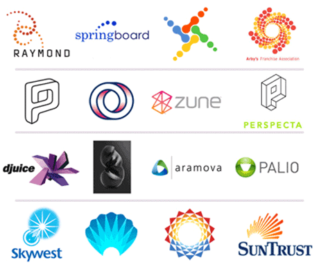
This image shows 4 rows of examples of trends:
- Dots in swirls
- Optical illusions using lines
- Folding, creasing, wrapping 3D
- Spectrals and bursts
6. Picking A Vague Logo
This one is easy – every logo should convey a message to the viewer. If potential consumers know nothing about your product after looking at the logo, you have failed.
While a simple logo may be best, that doesn’t mean it should be vague.
Example Signs of Vagueness:
- Swooshes: If they are just swoshes hanging around, they are not going to be remembered. Why? Because unless you sell a swoosh, or are Nike, it means nothing. You may have hopes of being Nike someday, but remember, when Nike picked that swoosh it was for a purpose.
- Dots: Dots are the latest trend. A row of circle dots mean nothing. whether they are in a circle or a triangle or the shape of a spaceship, they don’t convey a product.
- You can’t use your logo without your name: take the text out of the design. If you can’t see your product in it – it is too vague. Even text based logo’s like FedEx have the arrow in their design. So make sure you have meaning
Examples of companies with way to vague logos
If You Can Figure It Out, I Have A Cookie For You Logo

7. You Pick A Logo Best Suited For An Abstract Art Exhibit
Remember that while you want your logo to be professional and clean looking, you have to ask yourself what it ACTUALLY is. While an abstract logo can look pretty, you always have to ask yourself what does it really say to the customer? “We weren’t really sure how to visually represent what we do or how you will benefit from our services, so here’s a square with a circle thingy”
When picking a logo remember to DETACH YOURSELF FROM THE AESTHETICS. If you look at each piece, or the designer can’t give you meaning behind the logo – chances are it is just a piece of pretty abstract art.
Examples of Abstract Art

8. You Don’t Consider Its Place
A logo has more than one place (or should). It isn’t a graphic on the side of the building only, it isn’t a graphic on the website.
When chosing a logo also take into consideration these things:
- Can It Be Black And White?: There will come a time – whether it is advertising, corporate shirts, etc. where you will need your logo to go greyscale. If your whole logo hinges on colour, or its colours all become one, chances are you have a logo you can’t use.
- Can you Scale it Down?: If you can’t shrink the logo without it becoming intangible it is likely a poor logo. A logo has to become small for lots of reasons (tags, shirts, business cards, letter head, etc.)
- Can It Be Used For All Mediums? Can it bee scren printed? Can it be embroidered? Will it work in print, on a street sign, on a t-shirt? If it can’t then you did something wrong.
Examples of Non-Transferrable Logos

So the logo looks great in colour, but what about black and white? Colours with very close mixtures tend to turn out the same in BW. So make sure you can still read it when it is this way

This logo looks cool. But when small it doesn’t have the same effect. You have to be happy with the logo small as well as big.
9. You Put An Expiration Date On Your Company
A logo should be timeless. This isn’t just about its money value – but also about the fact that it should be recognizable. If you have to rebrand ever year then no one will remember you.
Don’t use images of materials unrelated directly to your company. For instance, a CD or a Cassette Tape, a bottle cap, bell bottom pants, a certain shape of car, a certain style of television.
Also again, avoid design trends. A bunch of blotches may seem ‘neato’ now, but in 5 months, when everyone else has the same logo – you may not feel the same way.
Examples of Logos That Can’t Time Travel

so this logo is outdated, the style of it is very early 90s. Because they used the trends of the time (rainbows, 3d text cut out of silver) and dated fonts, the logo now, well, just looks silly and cheap.
10. You Didn’t Really Look At Your Logo You Just Picked
Logo’s are things that sit out in the public eye, and are subject to the public’s imagination, perversions and sense of humor.
At first you may not see anything strange about your logo, and then for some reason you notice people aren’t coming in, some are laughing at your logo, and then eventually you find out what it is – it looks like something else.
I remember a sign that went up recently in Port Dover and it is supposedly a bear winking – but what the logo looks like really is a variety of things – most people say a whale in a sea of icebergs. A lot saw a cyclops doing something. As time went by people around started yelling “CYCLOPS BABY MOUNTAIN” as they drove by as rumor spread that is what could be seen in the logo.
The other possibility is that it could be read as being perverted, which is a very very bad outcome.
To avoid this get fresh eyes to look at it – as them what they see (without the text). If they define or identify anything you don’t want – you need to reconsider your pick. Make sure to get a teenager to look at it if you can – they will find the child molester in the dentist logo every time.
Examples of Logos That The Company Surely Wishes They Could Take Back

Well I think this one is self explanatory. No pediatric center wants pedophilia to be associated with their name. If the client looked closer at this logo, and had some other eyes, this could have been stopped.

While the sign clearly says “Kids Exchange” it also clearly reads “Kids Sex Change”. If the client had of read it a few more times, and there friends were any good, someone would have realized how important the spacing in those words really really was.
11. You Picked A Logo That Is Someone Else’s Logo
I know I mentioned this pretty much before, but it is SO important to mention a second time.
Look up key words from your logo on google logos. Research the best logo’s of that year. Make double sure before you purchase you didn’t just buy someone else’s logo. Why? because it is copyright infringement, and serves you no purpose
Examples of logos that are a bit too similar
Scottish Arts Council or Quark?

Changing colors or font and making the size of the whole a little bigger does not stop a logo from being seen as stolen. Truth is, neither of these company’s now have a unique identity, and both or one will have to pay to have their logo changed. The company’s are responsible in cases of suit. So make sure your logo just isn’t the same as someone elses with a couple different colors.

Again, changing just a few aspects doesn’t make a logo any less ‘uninspired’, stolen, or dangerous.
Conclusion
While you pay someone to do the work for the logo, remember at the end of the day this is what you are going to be spending your money on.
Rebranding costs a lot of money, and often a lot of customers. Always try to pick a logo that best represents your company, in any medium, and will be as timeless as you hope your product and venture is.
Don’t forget to subscribe to our RSS-feed and follow us on Twitter and Facebook for recent updates.
| About The Author | ||||
|
If you enjoyed this post, please retweet or stumble to say thanks!
Subscribe to:
Posts (Atom)

