
Friday
1 15 tips to choose a good text type
Many people have asked me which text type is best for a magazine, a newspaper, a poster, a newsletter, a publication, etc. In general, I tell them which to use, but I know that this is not the best answer, because they won't learn to do this by themselves.Today, I want to take time to analyze how to choose correct text typography design in different cases. It is very important to understand that these tips are not final word, but they can be good help at the moment of choosing a text type. In any case, it depends on what do you want to convey with this type, because many times legibility is as important as the character of the type. Try to be very careful and take in account the following points:

 1. The Letterform
The ‘ductus’ represents the framework of a type. It is very important. For legible text we need typographies with a simple ductus without complex details. Those details distract from the reading process and we need the reader to pay attention to the content and not the text.
 2. The Weight
When we discuss the ‘weight’ of a type, we refer to a consistent relationship between the characters themselves, and the light of the page that flows around them. If you use a light version of a type for a lot of text, reading of this text will probably become tiring and nobody will want to read it.
 3. The Contrast
The contrast refers to the thickness difference between vertical and horizontal strokes. The difference between the thicker and the thinner part of the character. Bodoni and Didot are very contrasted type designs. Try to read the photocopy of a photocopy of a photocopy of text layed out in Bodoni. You will probably see only vertical strokes. Good type design should be able to resist a lot of copies. It must be strong, solid, but not coarse.
 4. The axis
In my view, the axis of a type design could affect reading. Vertical strokes prevail in a text type and if the axis is diagonal, the eye will have trouble following that line of text. If the type uses more than one axis, a line of text will appear as if dancing which makes is harder to read. If we use an orthogonal axis, the characters can't dance.
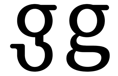
10. The Fish Effect
This effect becomes evident when the internal counter is bigger than the space between characters. It looks very strange where round and straight characters join.
 13. Is the set complete?
How many times do we note that the font we are using lacks a character? It always happens when our design is almost finished. Terrible! We must change the type and check out the complete text again. Many type designers don't design some characters such as ñ, written accents, tildes, points, commas or numbers… It is better to check the font out before using it.
 14. The family
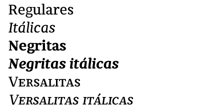
It is important to verify that the type family is plentiful, with variations in weight, black, whites and italics… Check out that the italic is as legible as the regular version. Sometimes they have a lot of rococo details.
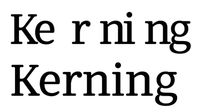 15. Letter spacing
There are fonts with bad or non-existent letter spacing and obviously, they don't work well. A good designer will try to correct the letter spacing that he (she) considers bad, but it is too much work when all the spacing looks bad… There are software packages that can help, but it is not the same as good typographer work. Try to use fonts with correct letter spacing and metrics…
1. The LetterformThe ‘ductus’ represents the framework of a type. It is very important. For legible text we need typographies with a simple ductus without complex details. Those details distract from the reading process and we need the reader to pay attention to the content and not the text.
2. The WeightWhen we discuss the ‘weight’ of a type, we refer to a consistent relationship between the characters themselves, and the light of the page that flows around them. If you use a light version of a type for a lot of text, reading of this text will probably become tiring and nobody will want to read it.
3. The ContrastThe contrast refers to the thickness difference between vertical and horizontal strokes. The difference between the thicker and the thinner part of the character. Bodoni and Didot are very contrasted type designs. Try to read the photocopy of a photocopy of a photocopy of text layed out in Bodoni. You will probably see only vertical strokes. Good type design should be able to resist a lot of copies. It must be strong, solid, but not coarse.
4. The axisIn my view, the axis of a type design could affect reading. Vertical strokes prevail in a text type and if the axis is diagonal, the eye will have trouble following that line of text. If the type uses more than one axis, a line of text will appear as if dancing which makes is harder to read. If we use an orthogonal axis, the characters can't dance.

5. x height
The area between baseline and x height contains most of the readable information (75% of the lower case letters). It is a very important area at the moment of reading text. Long ascenders and descenders require a small x hight. If we compare two types of designs, one with long ascenders and the other with short ascenders, we can see that the x height of the second one will be larger, so it will obviously be more legible. Look up for the difference between Times New Roman and Mrs. Eaves.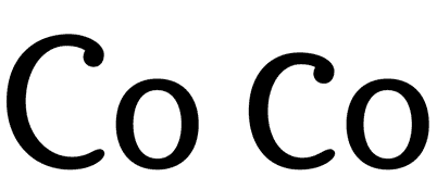
6. Capital letters height
Older typefaces designs consider the same height for the ascenders and the capital letters. In any cases capitals are bigger… But the appearance of a word in upper case between lower caps is usually ugly. When I write the word ‘Garamond’ I feel the ‘G’ as a dinosaur and the ‘a’ as its prey…
7. Endings and details
When we use a font in a big size (for example in a poster), we enlarge everything. All the small details of the type design become evident, as well as the mistakes. A lot of typographies are badly drawn. As designers, we should not accept this.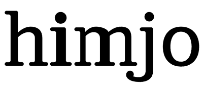
8. Text and texture
A block of text looks like a texture from a distance. This texture must be uniform, without thicker characters or spots that could attract the attention.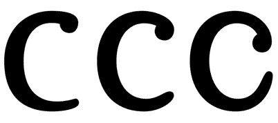
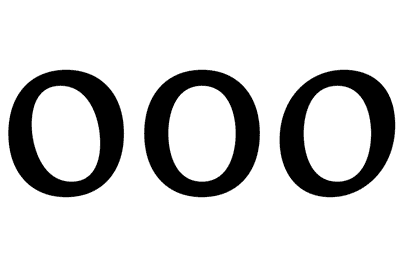
9. Degree of the Counter Opening
In many type designs, the counters are too closed. It could cause legibility problems, because somebody could read 'o' instead of an 'c'. So, if the internal counter is too opened (as in Frutiger), it will start to mingle with the external counter, generating a lot of white (and it looks ugly).
This effect becomes evident when the internal counter is bigger than the space between characters. It looks very strange where round and straight characters join.
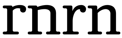
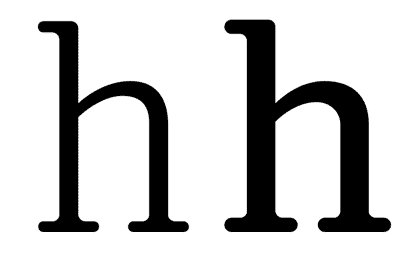
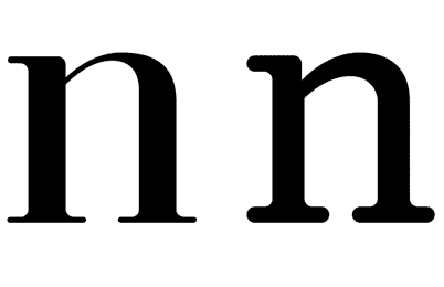
11. External counter
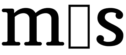
There are small details that make a text type design more legible. A carefully designed external counter leads to better text understanding. Think about the connection between the vertical stroke of the ‘n’ and its curve, or the difference between ‘rn’ and ‘m’.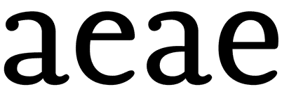
12. Internal counter
A small eye in an ‘a’ or an ‘e’ character will probably disappear, especially in small type sizes. These are the most used characters in most of the languages, that is why this becomes a very big problem.13. Is the set complete?How many times do we note that the font we are using lacks a character? It always happens when our design is almost finished. Terrible! We must change the type and check out the complete text again. Many type designers don't design some characters such as ñ, written accents, tildes, points, commas or numbers… It is better to check the font out before using it.
14. The familyIt is important to verify that the type family is plentiful, with variations in weight, black, whites and italics… Check out that the italic is as legible as the regular version. Sometimes they have a lot of rococo details.
15. Letter spacingThere are fonts with bad or non-existent letter spacing and obviously, they don't work well. A good designer will try to correct the letter spacing that he (she) considers bad, but it is too much work when all the spacing looks bad… There are software packages that can help, but it is not the same as good typographer work. Try to use fonts with correct letter spacing and metrics…

| About The Author | ||||
|

If you enjoyed this post, please retweet or stumble to say thanks!
Subscribe to:
Post Comments (Atom)


1 comments:
There are software packages that can help, but it is not the same as good typographer work. Try to use fonts with correct letter spacing and metrics
Billig WOW Gold
World of Warcraft Gold Kaufen Billig
Post a Comment